

You are now in the main content area
At home and on campus, run VPN before logging into AEM. Staff or vendor VPN only.
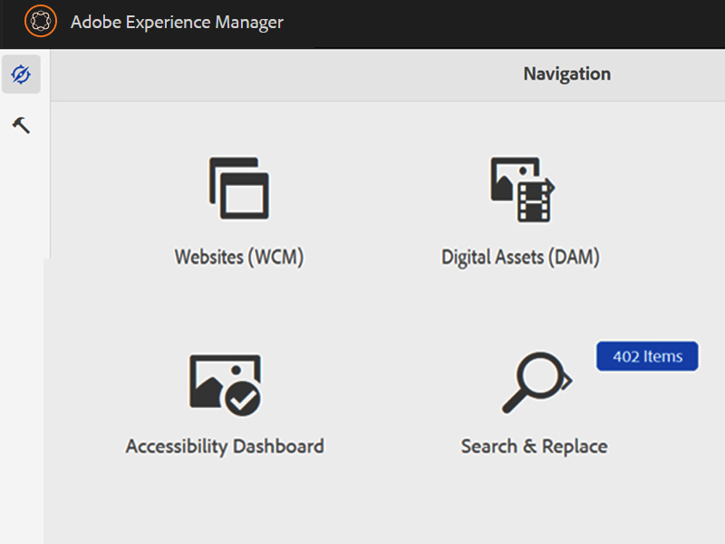

Quickly locate images missing alternative using the Alt Text Dashboard.
Get help


For all Siteimprove & Google Analytics inquiries, please contact Jiwon Bang, User Experience Designer, University Relations.

Need a new website, or help with updates?
Just launched your site? Be sure to review the Post-release Checklist.